
WayfinDinG and Signage Design
-
Projects focused on understanding patient and visitor patterns and traffic flow. Providing the best route and clear directions in otherwise confusing interior and exterior environments.
-
Projects focusing on ADA and NFPA compliance, using tactile Grade II Braille and raised lettering. Examples are those such as room and fire evacuation signs.
-
Internal company branding and miscellaneous work for GDS.
Notable Health & Hospital Clients
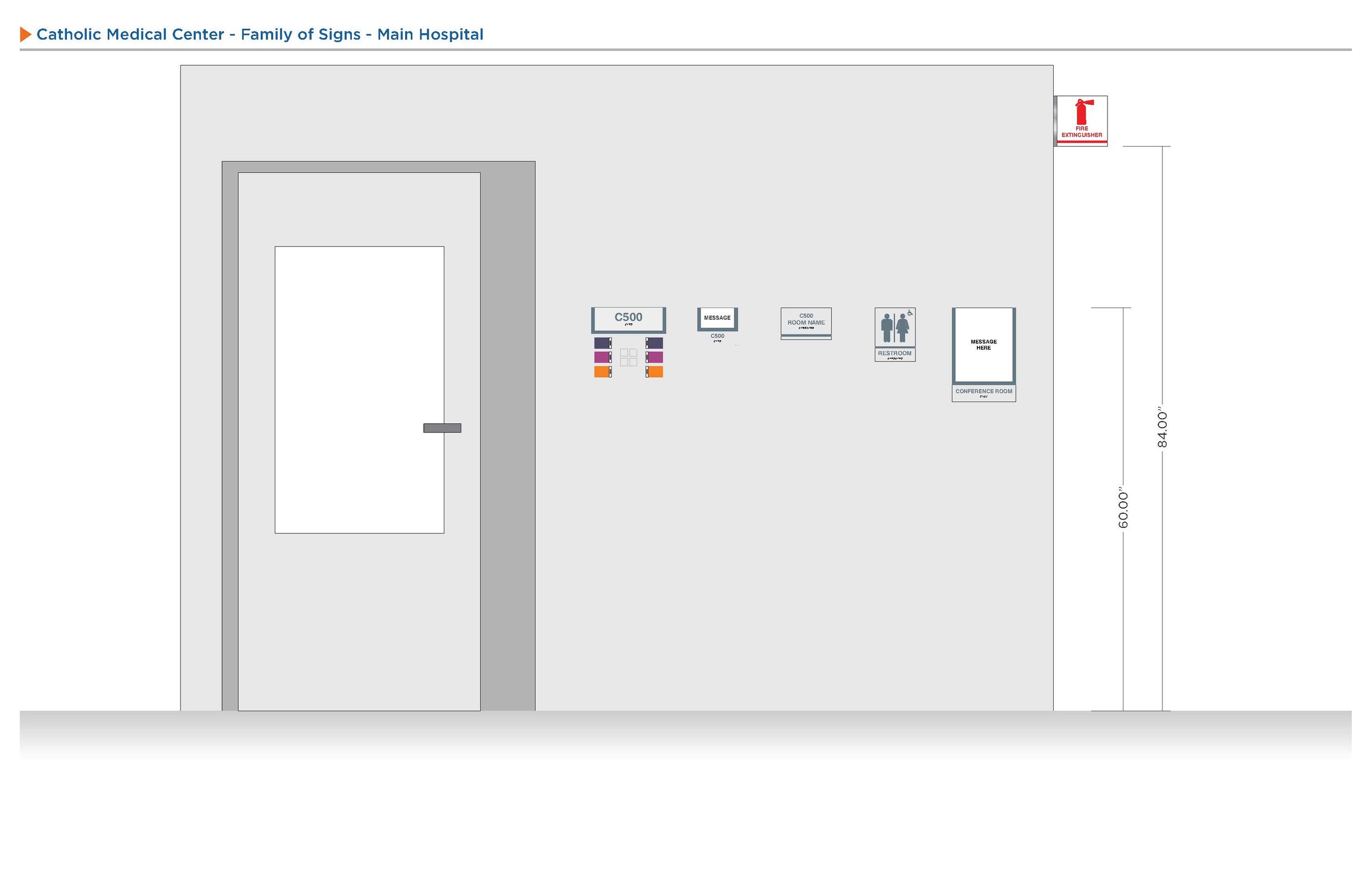
Catholic Medical Center (CMC)
Ellis Medicine
Hackensack Meridian Health
Hospital for Special Surgery (HSS)
Montefiore Hospital
Mt. Sinai
New York City Health & Hospitals (NYCH+H)
NYU Langone Health (NYU)
Westchester Medical Center (WMC)
Notable Education Clients
Boston University
Howard University
Miss Hall's School
Mohawk Valley Community College
New York City College of Technology (NYCCT)
SUNY Suffolk Community College
The difference being “Looking” and “Seeing”
Wayfinding and Signage is a form of language in our world. Looking at signs and directions is not something you realize you’re doing all day. It is so commonplace and present that we hardly ever notice it, and yet its there.
Below is a small sample of the work I did at my tenure at GDS Signs. A New Hampshire founded signage company in the mid-90’s that slowly expanded into the NYC tri-state area before settling and moving to Long Island, NY.
Projects feature ranged from the smallest of orders such as individual signs, die-cut vinyl graphics, and inserts to the largest of wayfinding studies and full 360 campus projects. Ever since my time there, I can no longer go anywhere now-a-days without looking at the signage!
WAYFINDING
WAYFINDING
Wayfinding Design Projects:
Projects focused on understanding patient and visitor patterns and traffic flow. Providing the best route and clear directions in otherwise confusing interior and exterior environments.


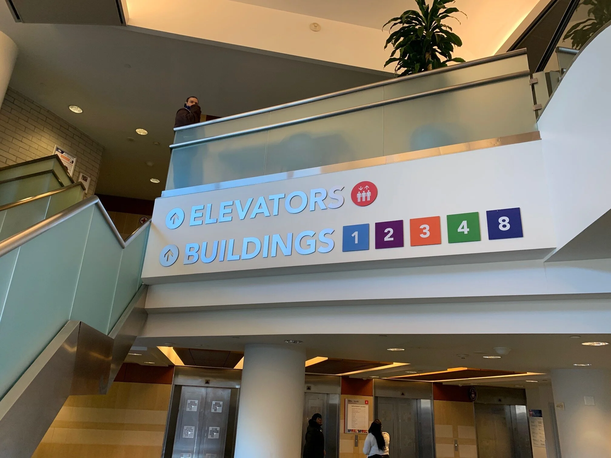


Hackensack Meridian Health
Challenge:
After going through a near 4 year merger and rebranding, Hackensack Meridian Health needed a new signage system to unite it’s new gigantic network of over 10 hospitals.
Outcome:
The individual campus buildings were broken up by color designation by wing. Each hospital ended up taking on a personality of there own, each with there own color scheme to match their location. Design focuses on the elevator bays and moved outward to help ease patient traffic flow and provide a easy to understand system to get individuals to there loved ones, in an otherwise stressful environment.
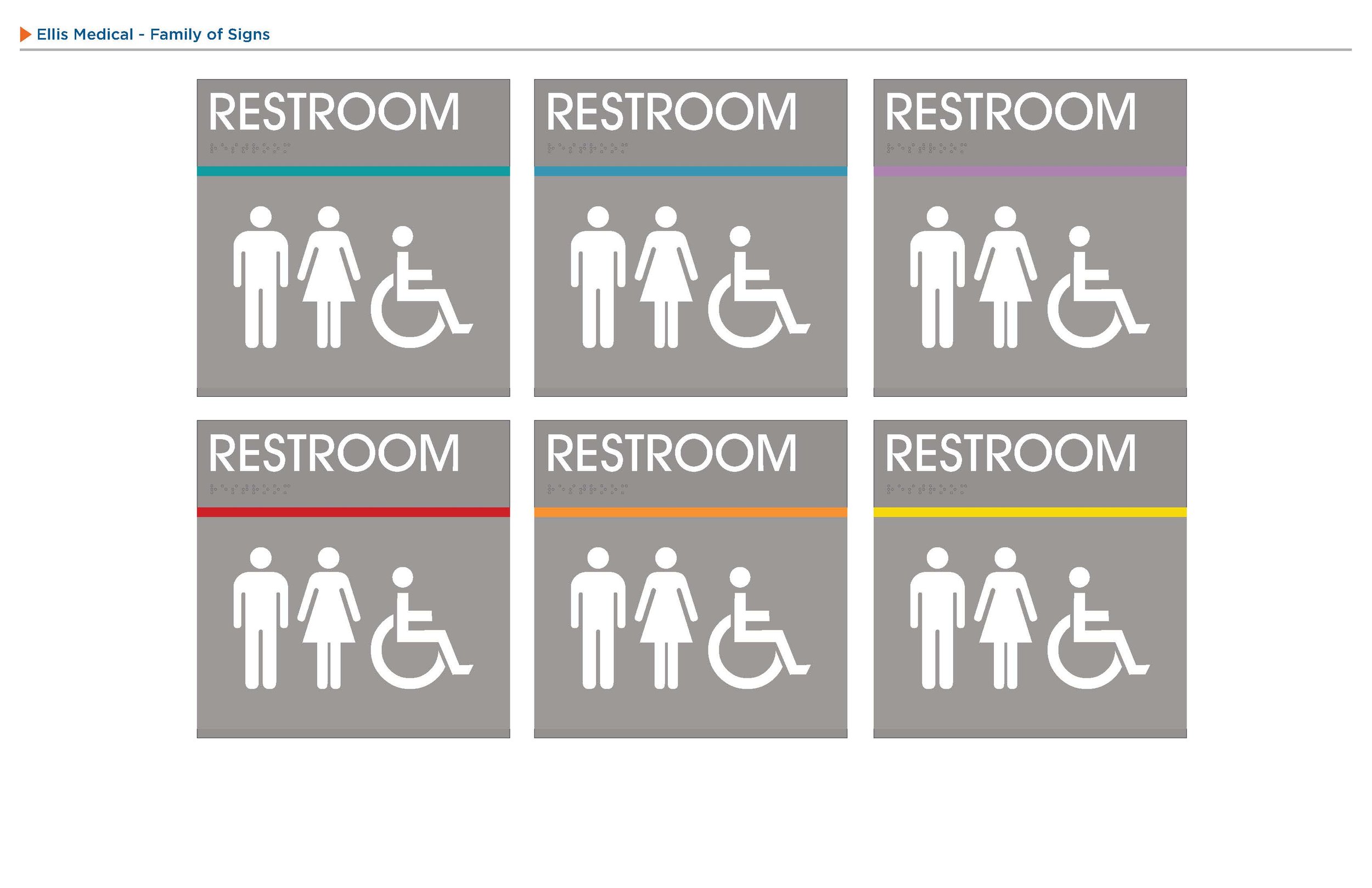
Ellis Medicine
Challenge:
Ellis Medicine had a mix of different sign types over the course of many years. They were in need of combining the existing look while updating it with their new department renovations.
Outcome:
Wings were broken up by color designation. With directionals focusing on the main “attraction” of each wing. All signs were reformatted to a modular template that could be updated and editing in a quick and efficient manner. This template help lead to a concise and formatted look to the institution.
PROJECT SPOTLIGHT


SIGNAGE
SIGNAGE
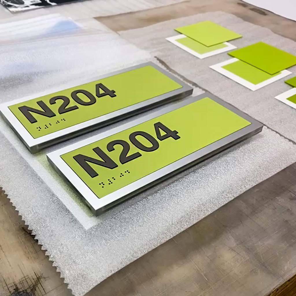
SIGNAGE Design Projects:
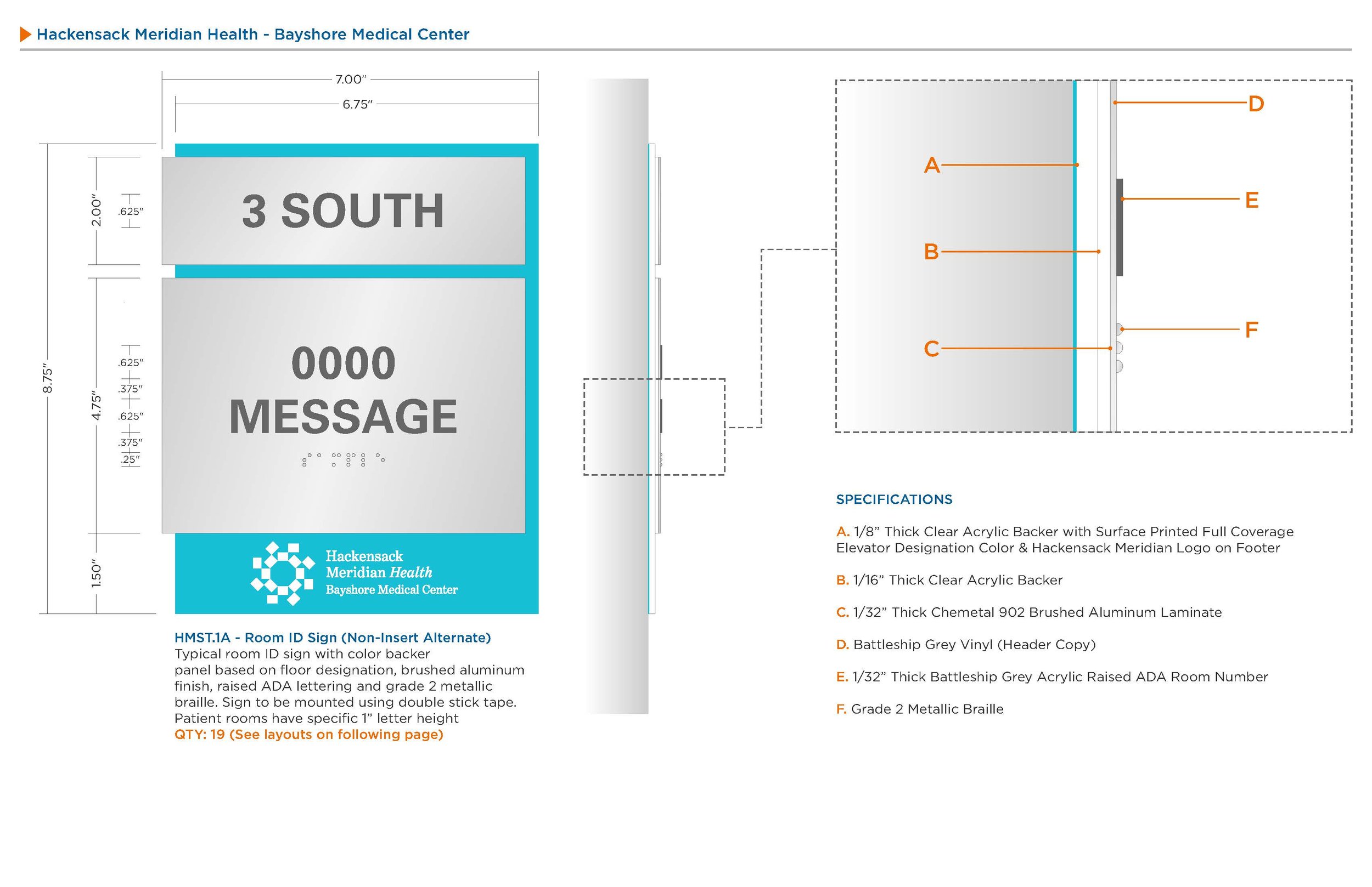
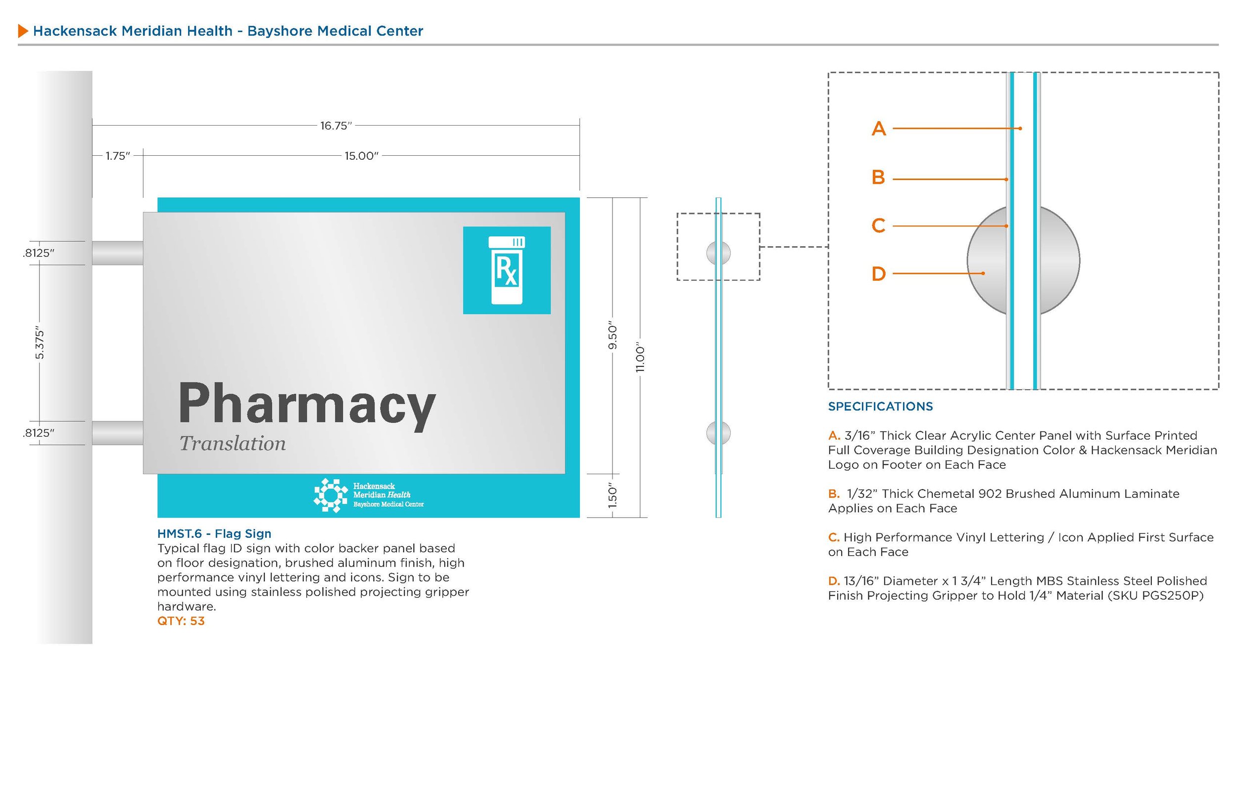
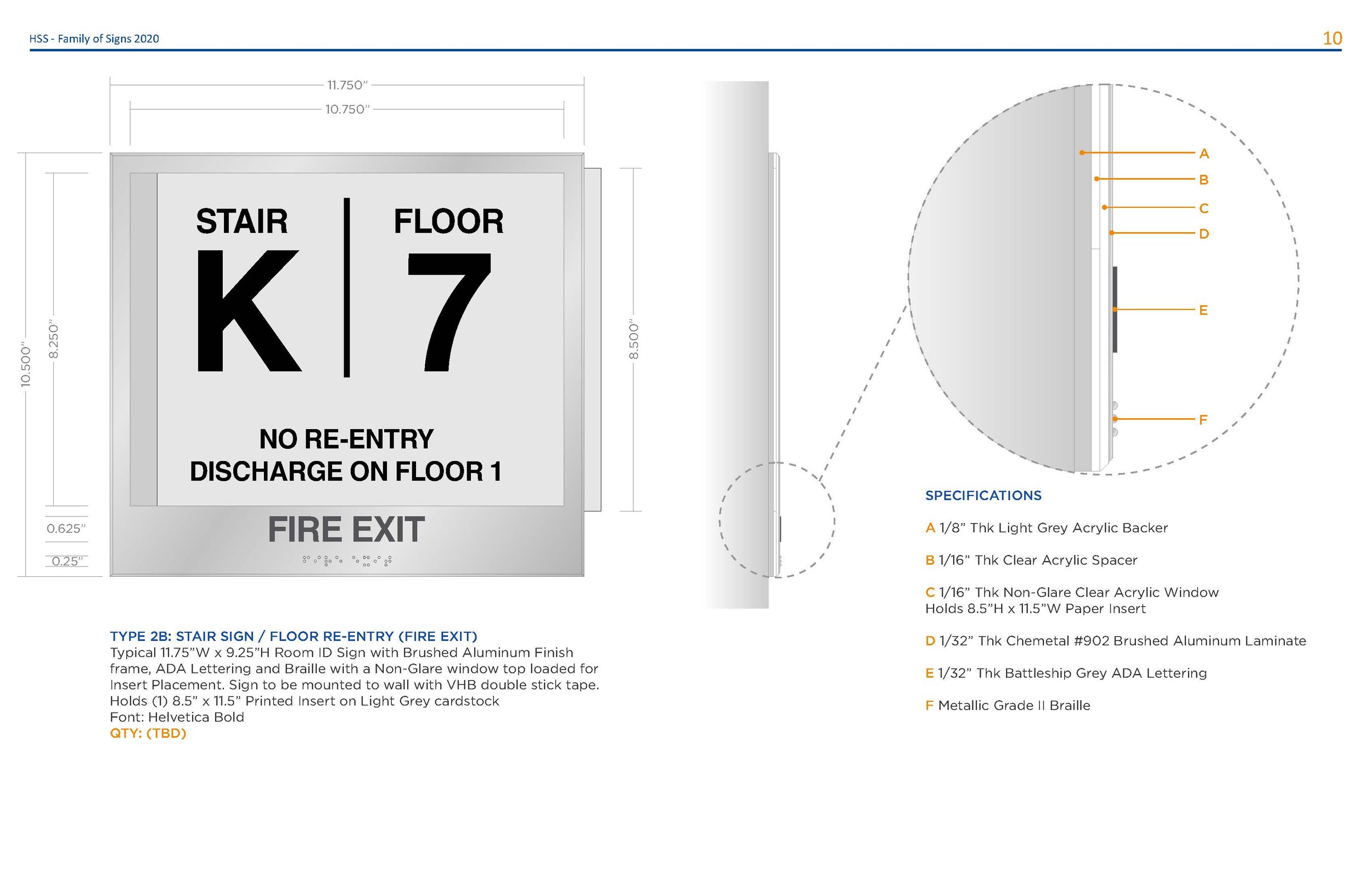
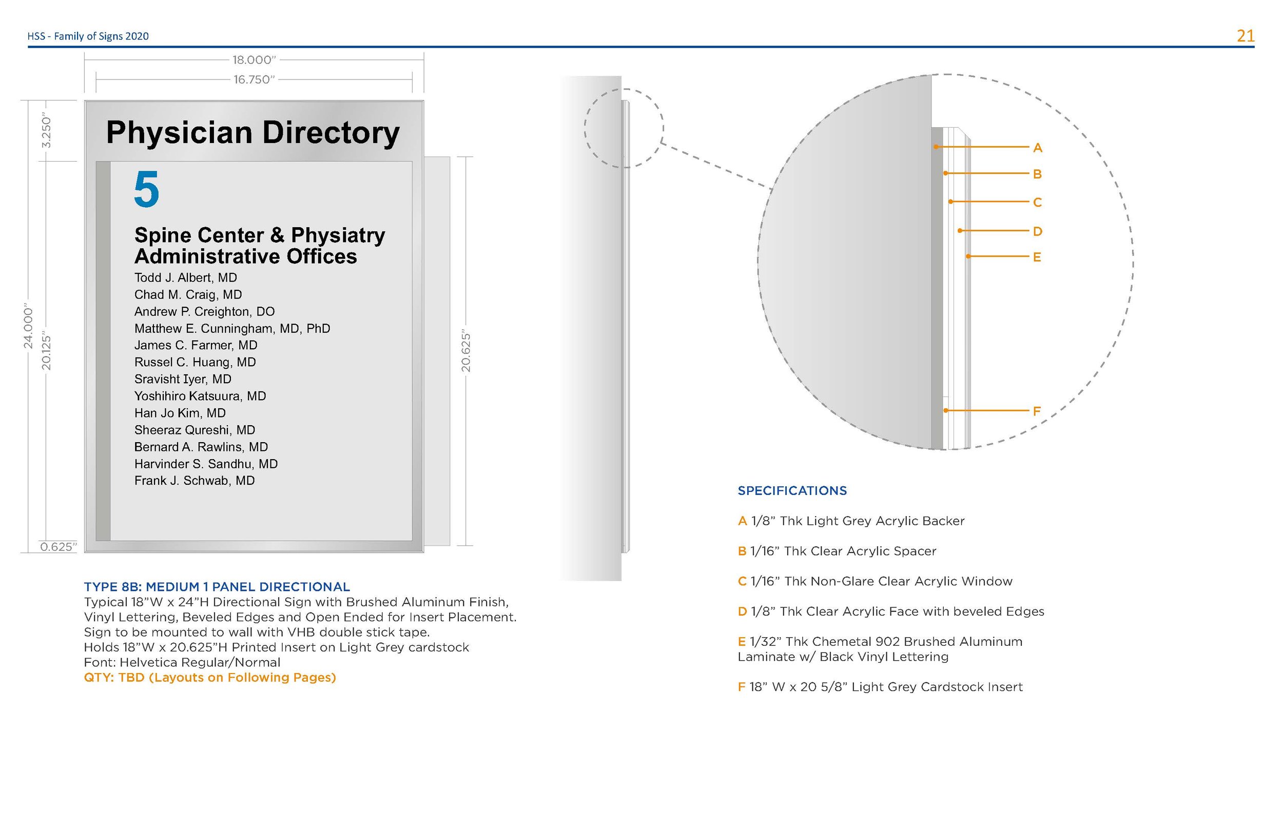
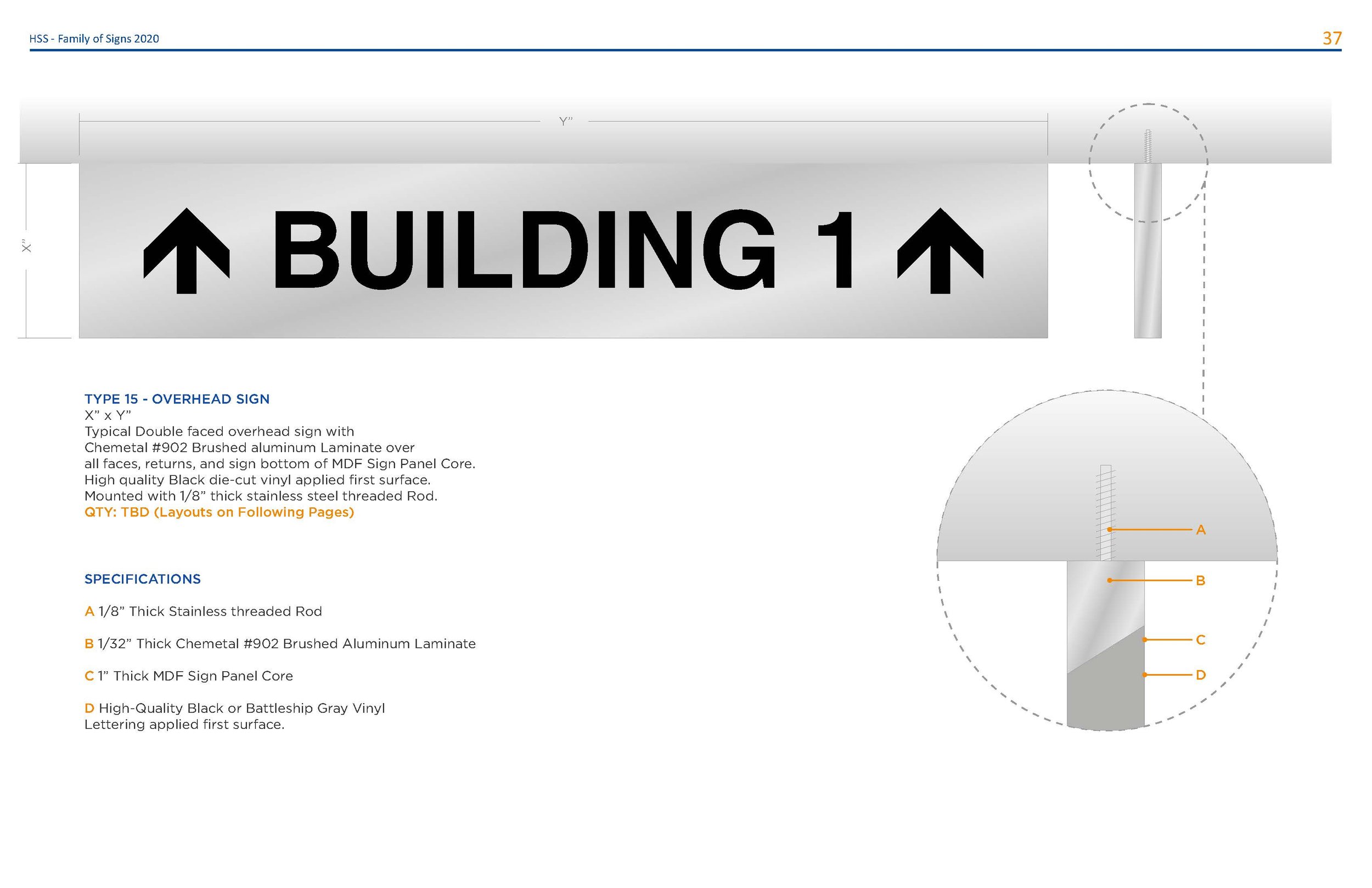
Projects focusing on ADA and NFPA compliance, using tactile Grade II Braille and raised lettering. Examples are those such as room identification and fire evacuation signs.


![IMG_8007[1].jpg](https://images.squarespace-cdn.com/content/v1/5fcfddc22417856671a6120c/2cf52114-ebf8-496a-be00-5545489108ea/IMG_8007%5B1%5D.jpg)
![IMG_8026[1].jpg](https://images.squarespace-cdn.com/content/v1/5fcfddc22417856671a6120c/b95265b7-aaae-44ae-a7f9-c48c3776023c/IMG_8026%5B1%5D.jpg)
![IMG_8031[1].jpg](https://images.squarespace-cdn.com/content/v1/5fcfddc22417856671a6120c/a3ca9b04-dcc9-47aa-9df6-b1c3396fe766/IMG_8031%5B1%5D.jpg)


![IMG_8035[1].jpg](https://images.squarespace-cdn.com/content/v1/5fcfddc22417856671a6120c/dd08ce1f-2ee9-4a38-8b60-9ab82082aebd/IMG_8035%5B1%5D.jpg)

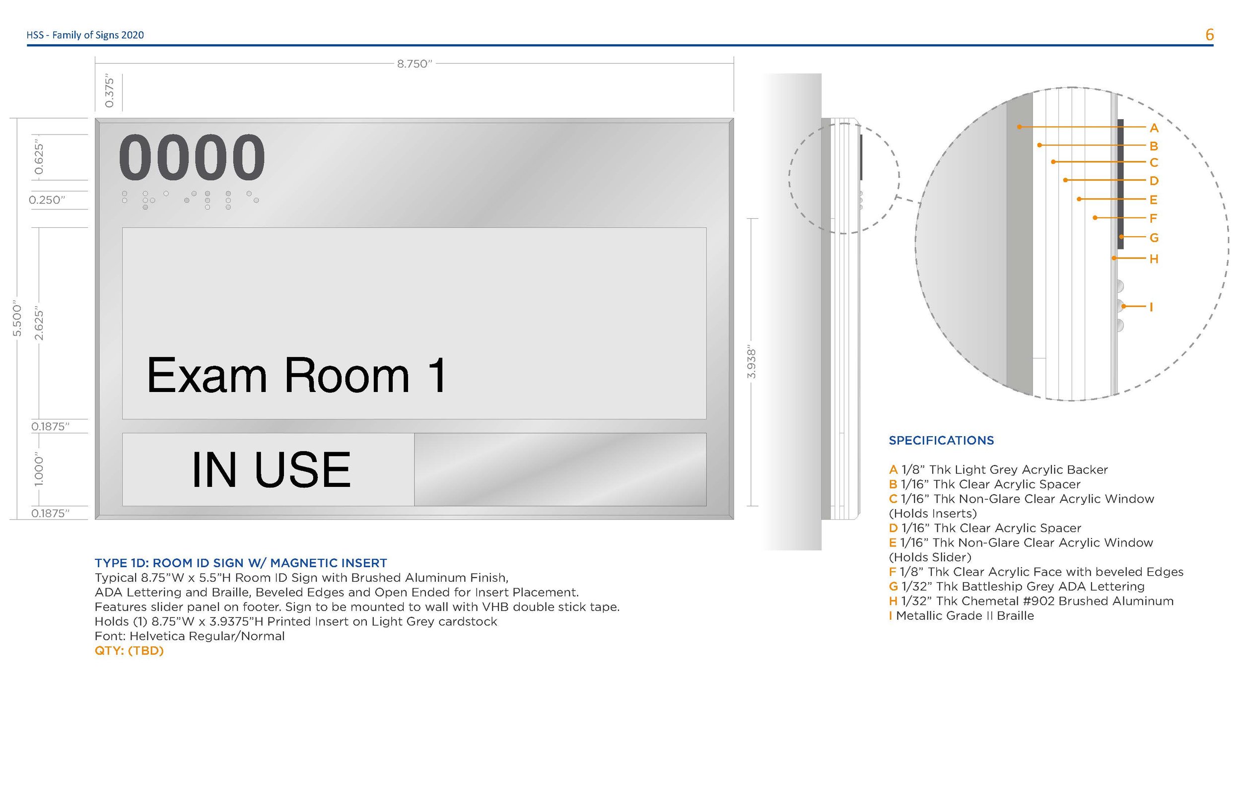
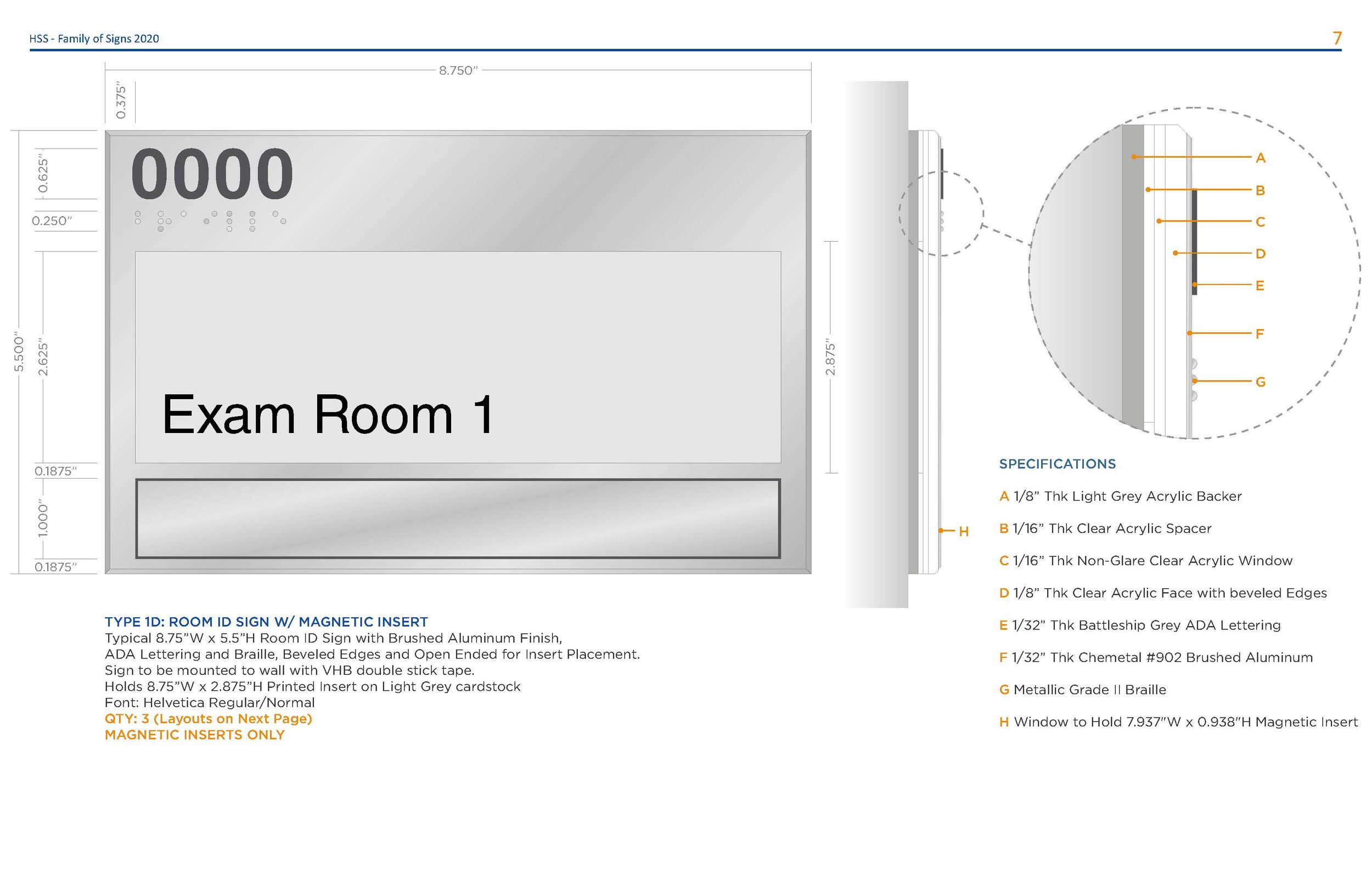
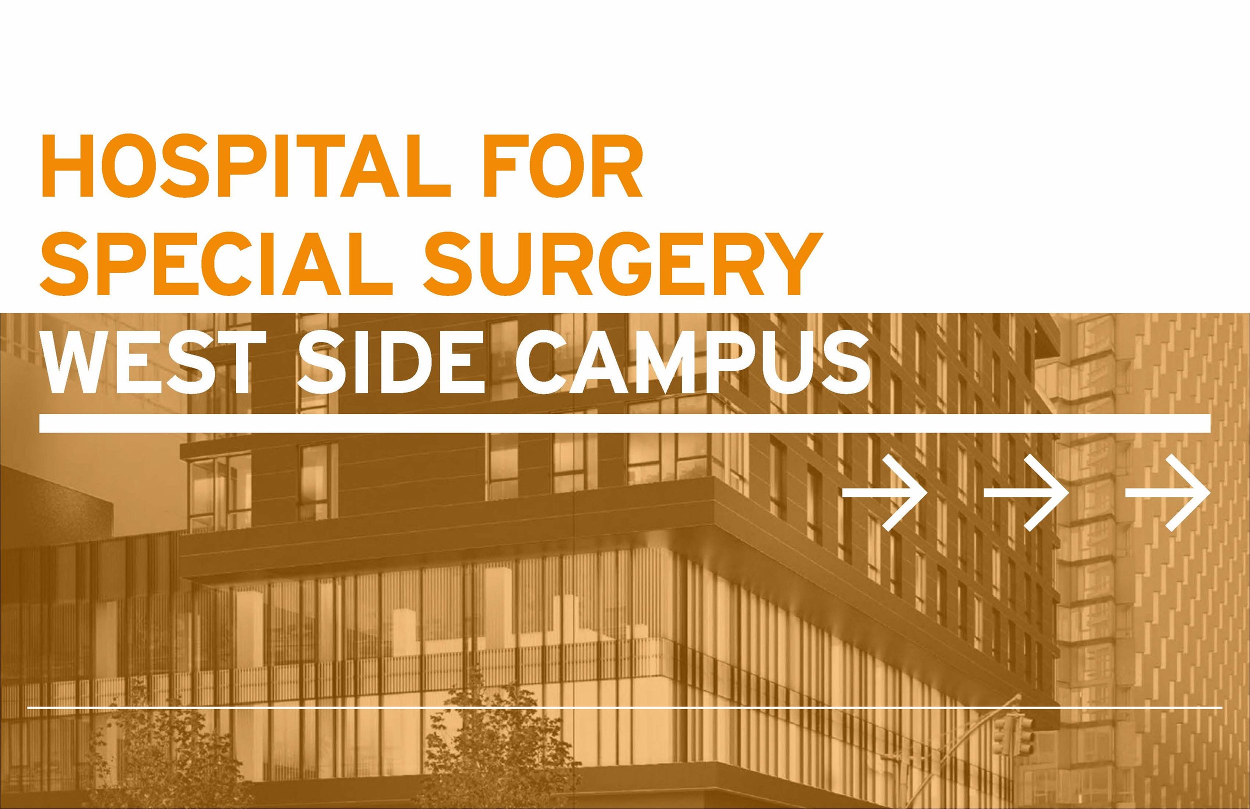
Hospital for Special Surgery
Challenge:
HSS chose GDS as it’s preferred vendor of choice when it comes to signage. The challenge was the multitude of signage designs it accrued through out the years.
Outcome:
Over the course of my time at the company I created a “Family of Signs” packet that contained all necessary sign types and kept track of their modifications and provided solutions when encountering improperly made ones. This guide has been use since 2018 with yearly updates and is still being used today as a means of updating all campus signage.
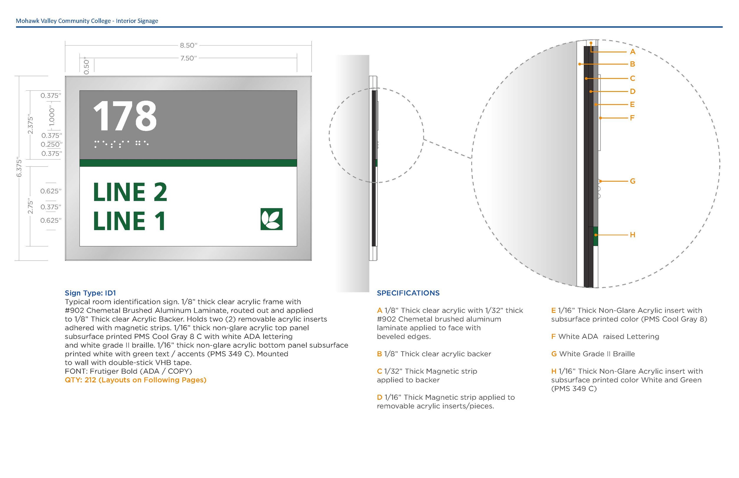
Mohawk Valley COMMUNITY College
Challenge:
MVCC had a very quick turn-around job as they had an upcoming inspection due their current signage being non-compliant. This would to be a full campus update within a 2 month period.
Outcome:
New ADA compliant signs where made to fit existing wall mounted signs. The new acrylic pieces would snap into place and remain held with magnetic backs.
PROJECT SPOTLIGHT


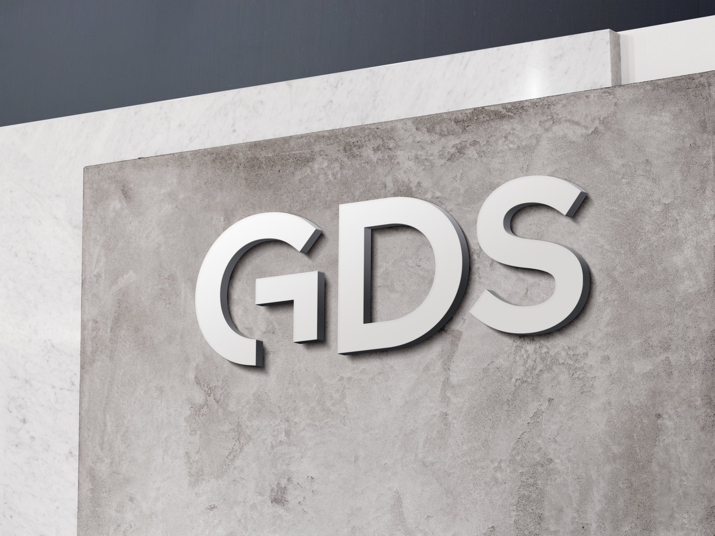
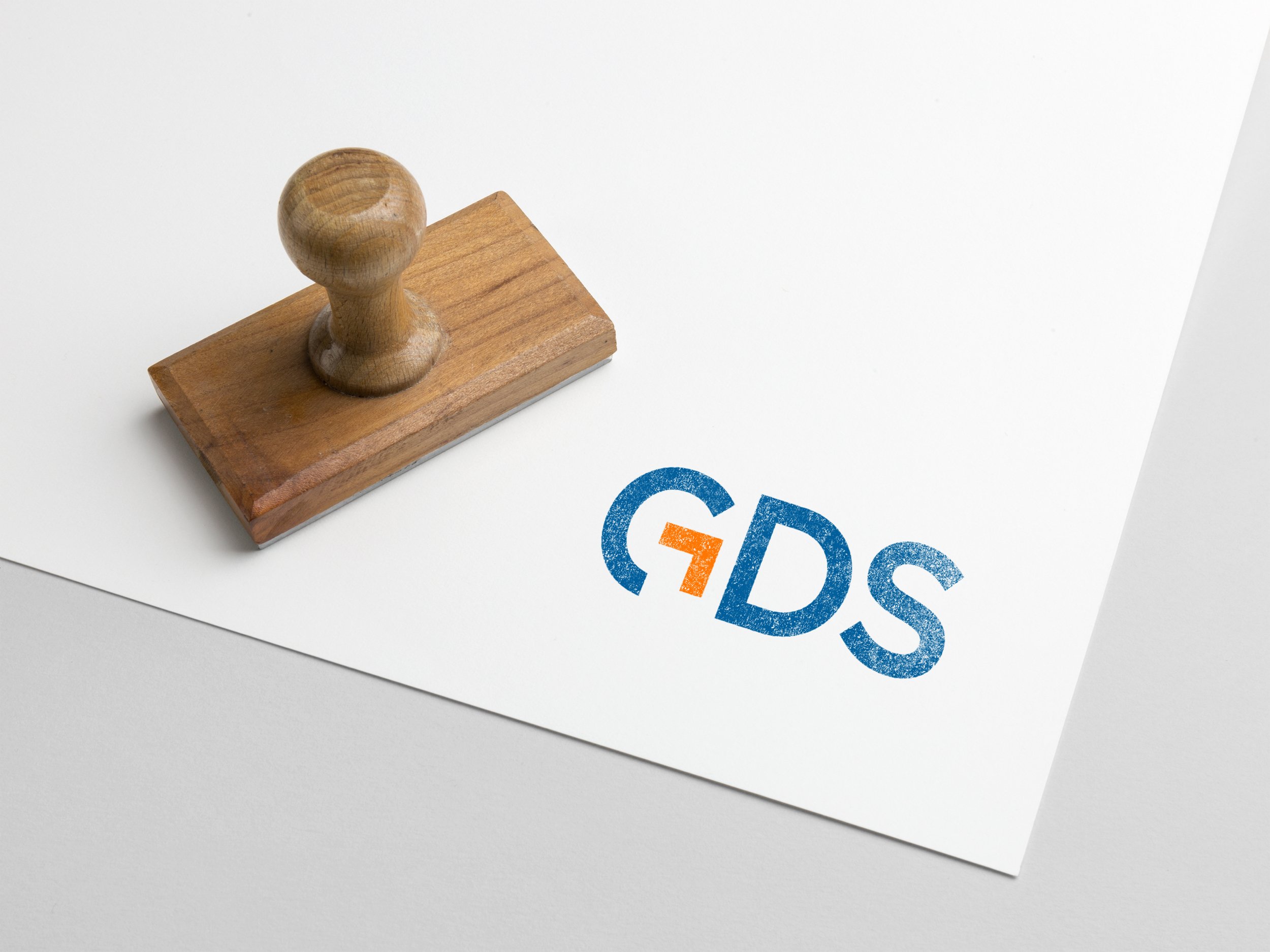
BRANDING
BRANDING
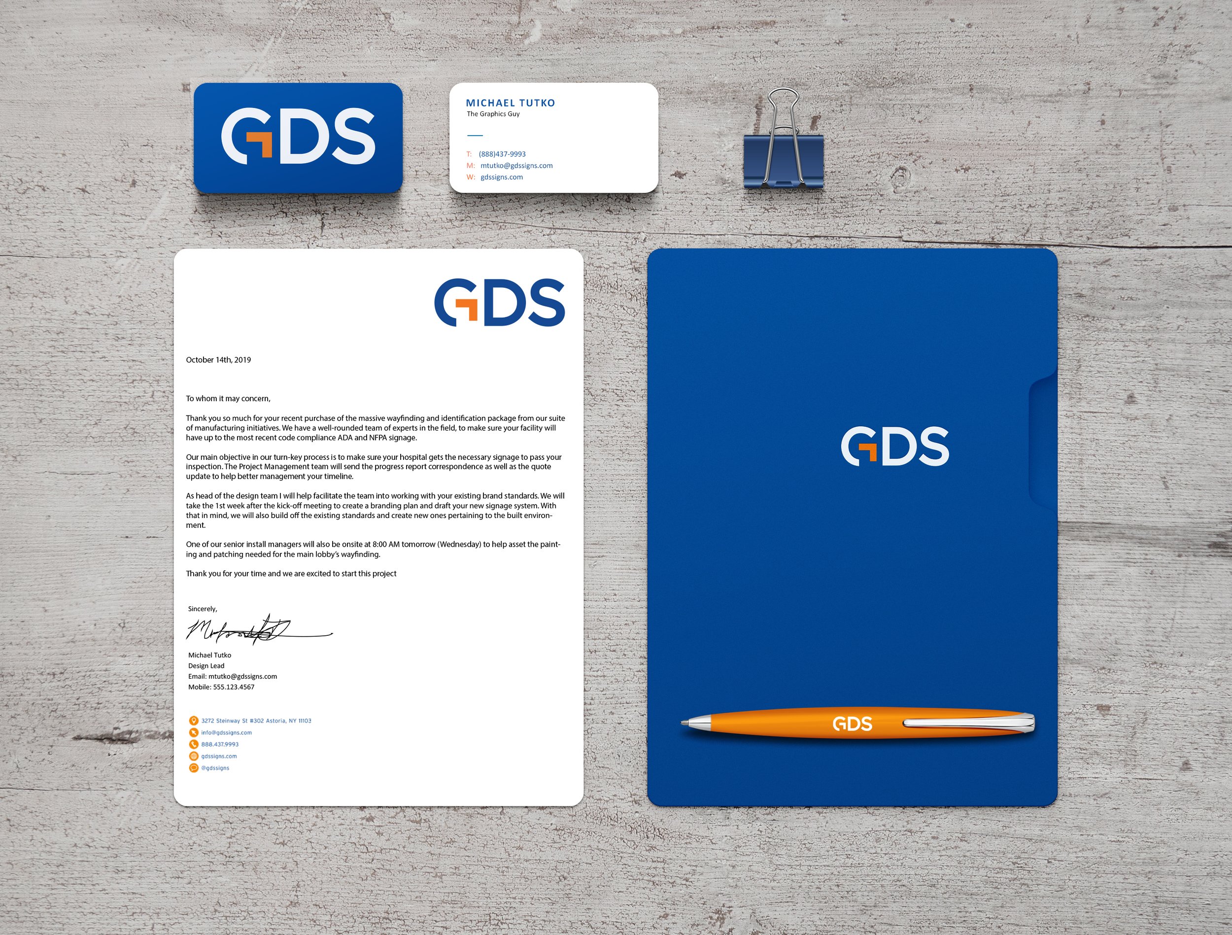
GDS BRANDING:
Internal company re-branding and miscellaneous work for GDS.


MISC.
MISC.
MISC. Work:
One of the practices I put in place while there was putting together a new starter course for new designers and project managers hired by the company. ADA and NFPA “cheat sheets” and a user friendly “training sign” were created out of a need to provide an easy way of learning to help individuals new the industry.
The example here was physically made by the product team and used a great learning tool using some of the company’s most common materials and manufacturing techniques.

COVID-19:
During the months of March to April of 2020, as the world was coming to grips with the COVID-19 pandemic, I was lucky enough to still be in a position to make an impact. One of the side projects I help start were simple, easy, and direct Covid-19 signage to help with the constantly updating laws and need for clear visual communication of these rules.


