[Keen-Wah]
⎯
[Keen-Wah] ⎯
Solution
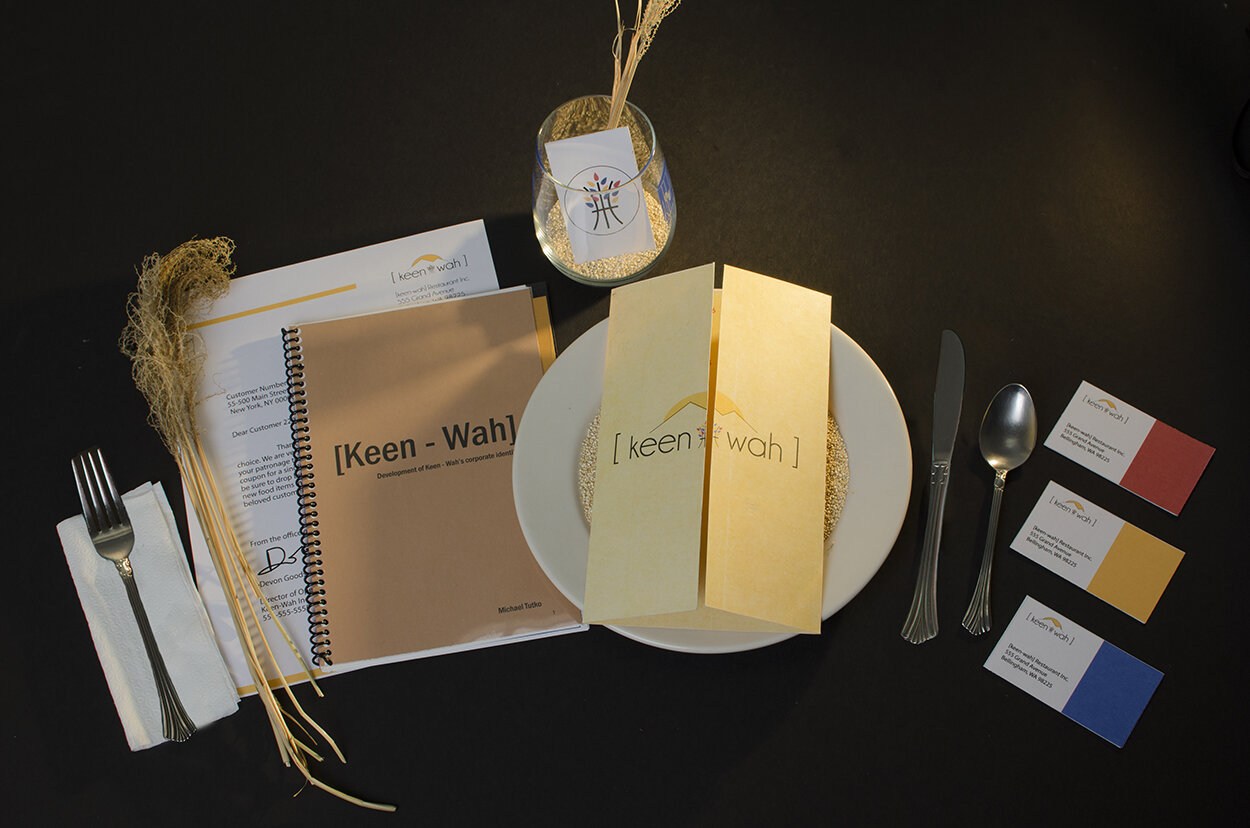
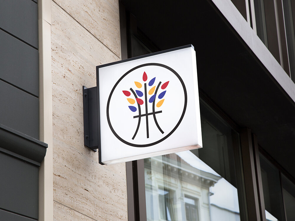
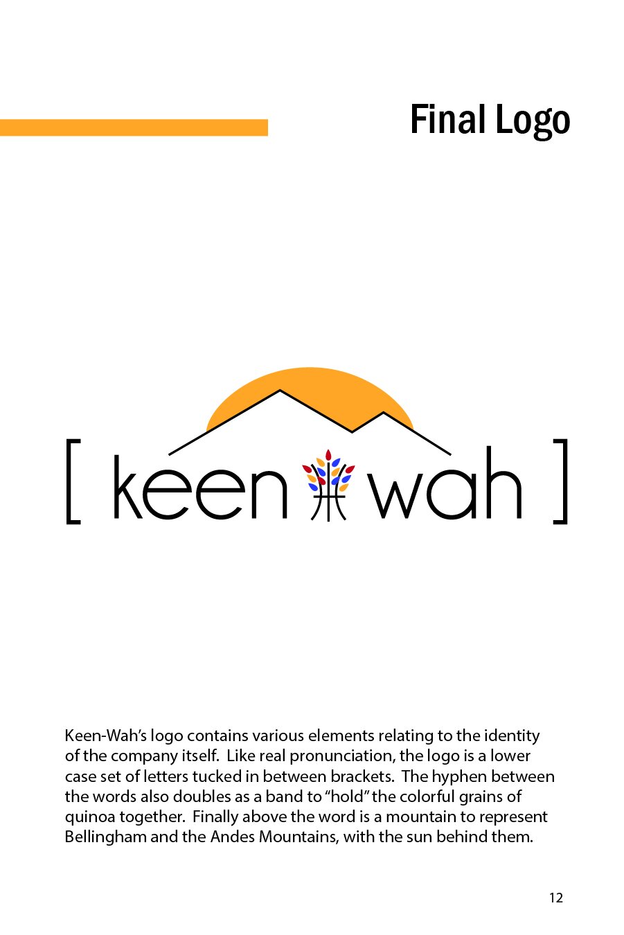
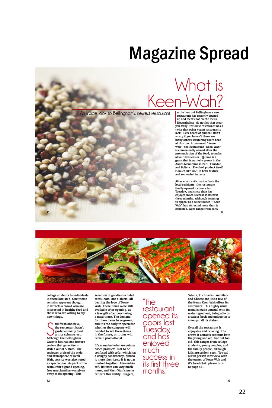
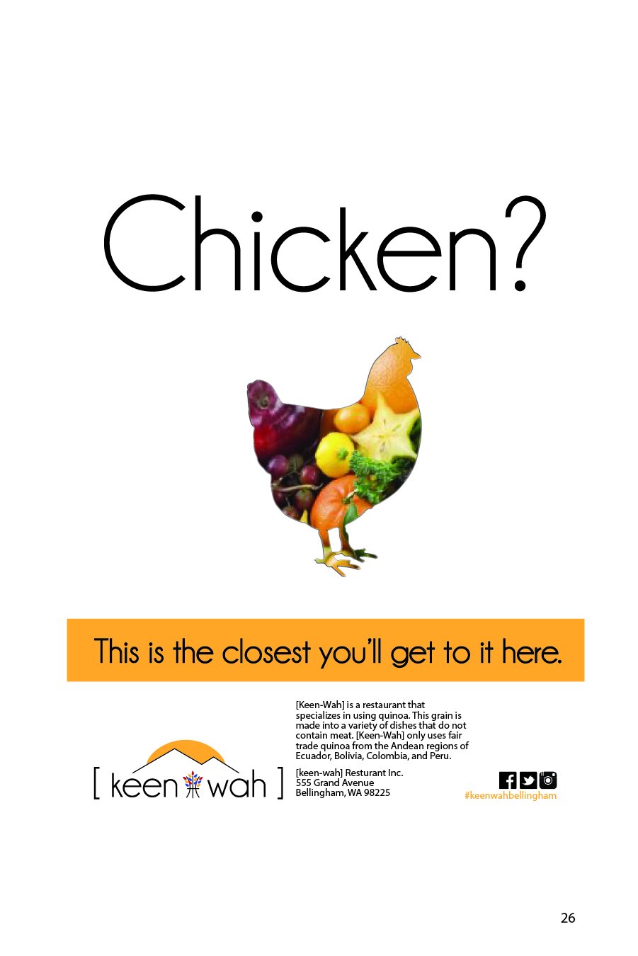
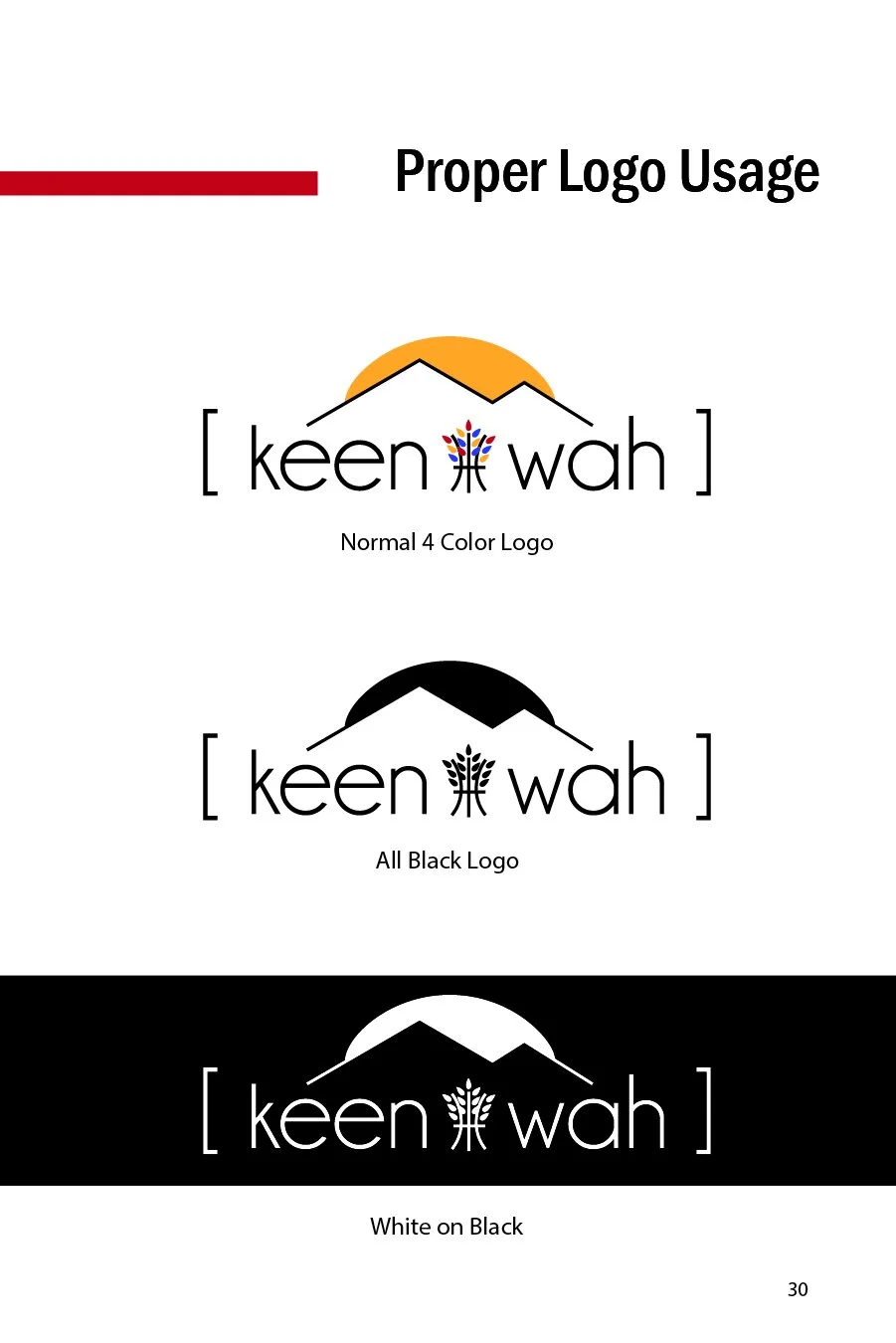
The name of the restaurant brand came from my initial research of the main ingredient of every dish; quinoa. I had both never heard of quinoa before, and initially had trouble saying it. Thus my “phonically pronounced logo” was created. The logo focusing on the pronunciation of the word tied together with the colorful grains of the quinoa planet, resting under the foothills of Mt. Baker in Washington State.
I thought it was a nifty fit for a brand that’s main focus was to create fun and health meals. Creating this fun atmosphere for sustained health as opposed to making it a “chore” or something that needs to be “worked on”. The focus was to be young adults and those who need a little encouragement to ease into a healthy lifestyle. The menu also contained no meat products and would remain mostly vegan, some cheeses and products in that vein would still be present on a handful of recipes.
Concept
Fictitious restaurant brand created for a college project partnership with culinary student majors. Restaurant was created on what kind of business the client wanted based off of their menu creation, recipes, and culinary expertise. My project was a restaurant based in Bellingham, WA called [Keen-Wah].
A core component of the project was to design the restaurants menu, this was then followed by the logo and any other collateral or branding needed. Another key feature added in, was the corporate identity booklet. This helped to showcase the brand’s focus on maintaining a colorful yet minimal style. While also expressing it’s mission to provide healthy meals from reputable farms and sources of food.